
Practical prompts
AI Interior Design Prompts: 20 Practical Examples for Room Redesigns
Copy 20 focused prompts for colors, materials, styles, lighting and revisions, with advice on when to use each and what to check.
The most useful prompt is often a small one: change the rug to blue and keep the rest. It gives you a result you can compare, learn from and refine. A request for a beautiful room leaves much more of the decision to the model.
These 20 AI interior design prompts are grouped by the kind of change you want to make. Each includes a use case, a copyable instruction and a review point. Start with one decision rather than combining every idea into a single request.
Choose a prompt that matches the size of your decision
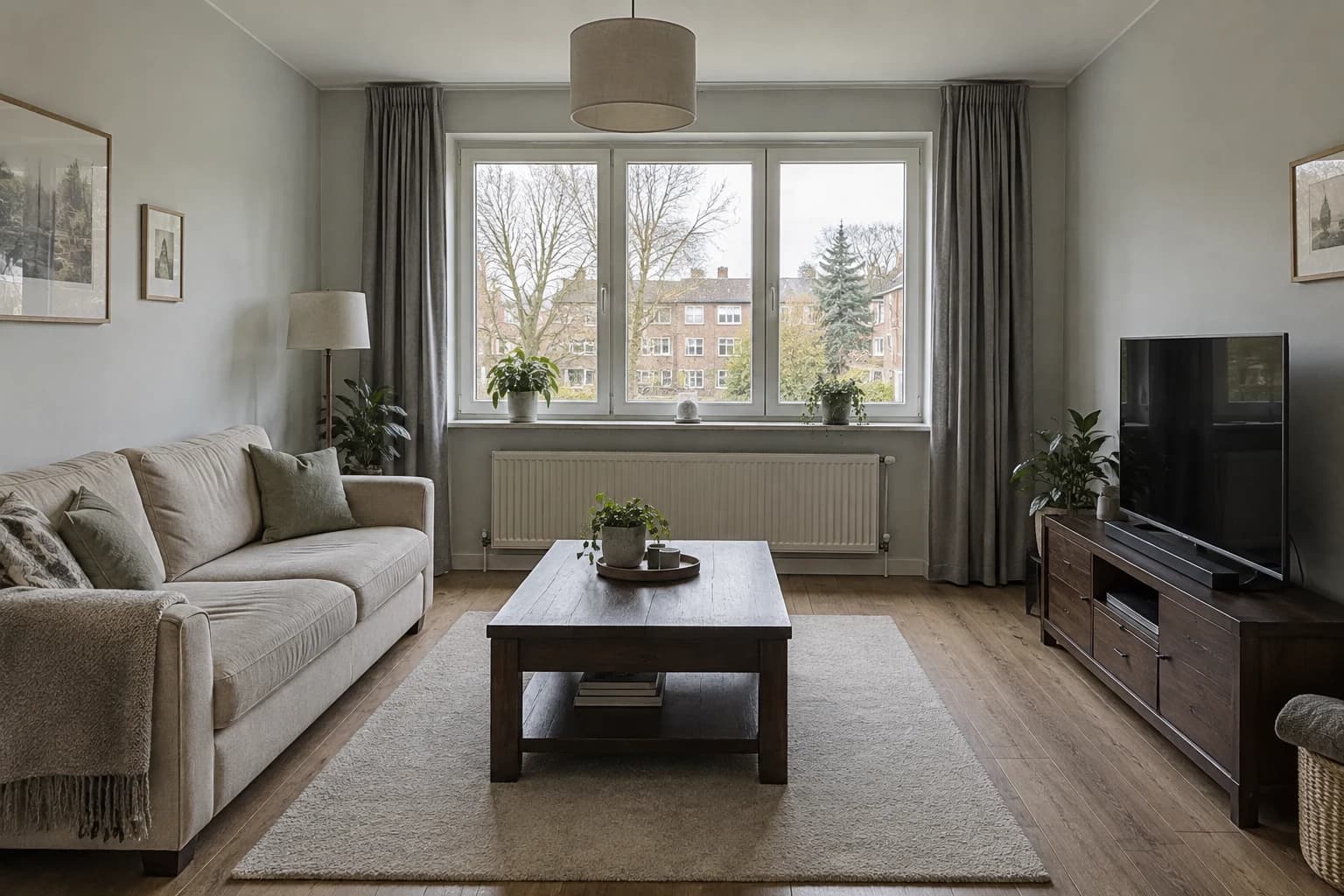
A useful interior prompt names three things: the surface or direction to change, the elements to keep and the visual result to compare. The examples below range from a single rug to a whole-room style. Choose the narrowest one that answers your current question, then adapt the object names to what is actually visible in your source image.
For initial alternatives, return to the same source each time. For a focused improvement to a selected concept, use that result as the parent. This distinction keeps a color comparison from inheriting unrelated changes and keeps a revision connected to the decision you already made.
Worked results appear in the small-change, material, style and revision groups below. They show which source or parent image was used; the other prompts are starting briefs to adapt to your room. Different inputs and model behavior will produce different results. Use the check after each prompt to decide whether the output answers the request.
Small changes: test one visible surface
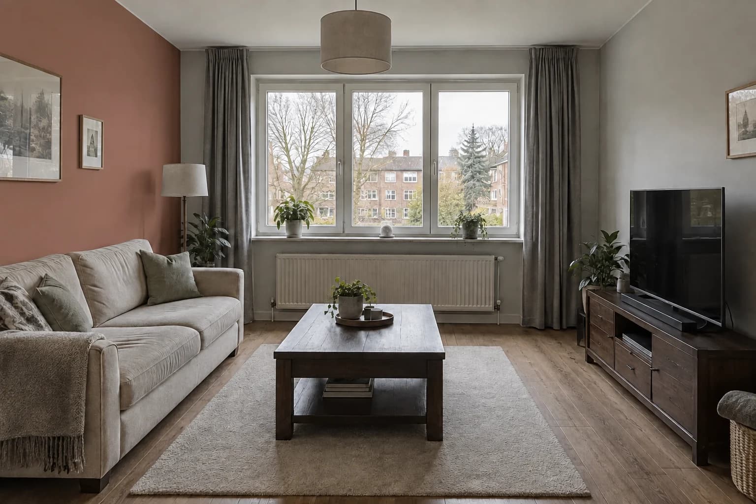
1. Terracotta accent wall
Use this when the furniture works but the wall behind the sofa feels anonymous. A single-wall request tests the color against your existing upholstery, so you can decide whether paint alone creates enough of a change.
- Check the result: Check the ceiling line and adjacent wall: the color should stay on the selected wall. In this worked result, the softer clay color changes the backdrop while the grey curtains remain.
2. Cobalt rug
Use this when you want a stronger color in a replaceable item. Keep the rug’s position in the brief so you can compare the color relationship without also deciding on a new rug size.
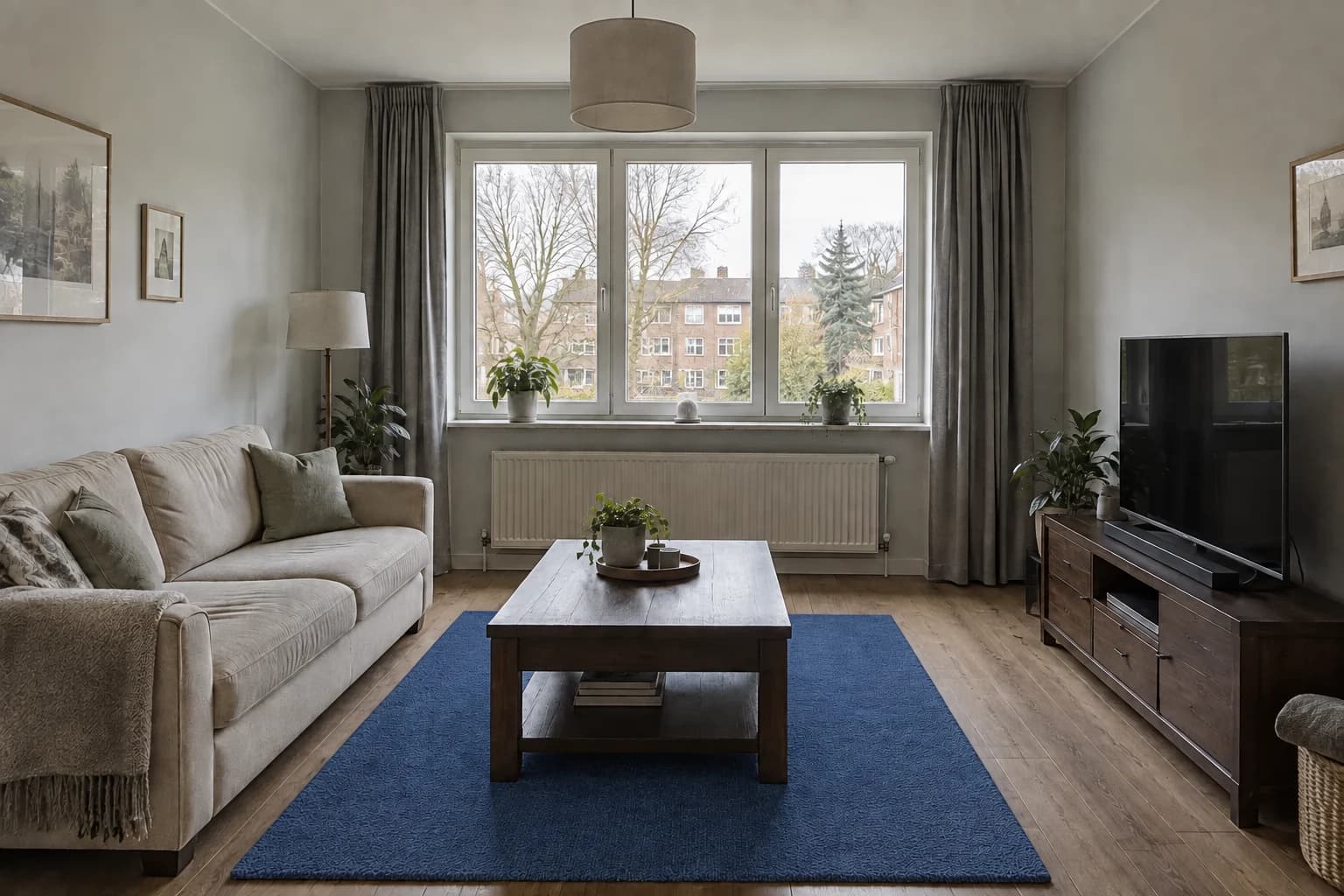
- Check the result: Check the rug edge against the table and sofa. The example becomes blue but retains a visibly textured surface rather than a perfectly flat weave; use a sample to choose the actual construction.
3. Olive curtains
Use this when the window treatment is a large neutral area and you want to test a muted color. Keeping the length helps you judge the vertical color band rather than an entirely new curtain arrangement.
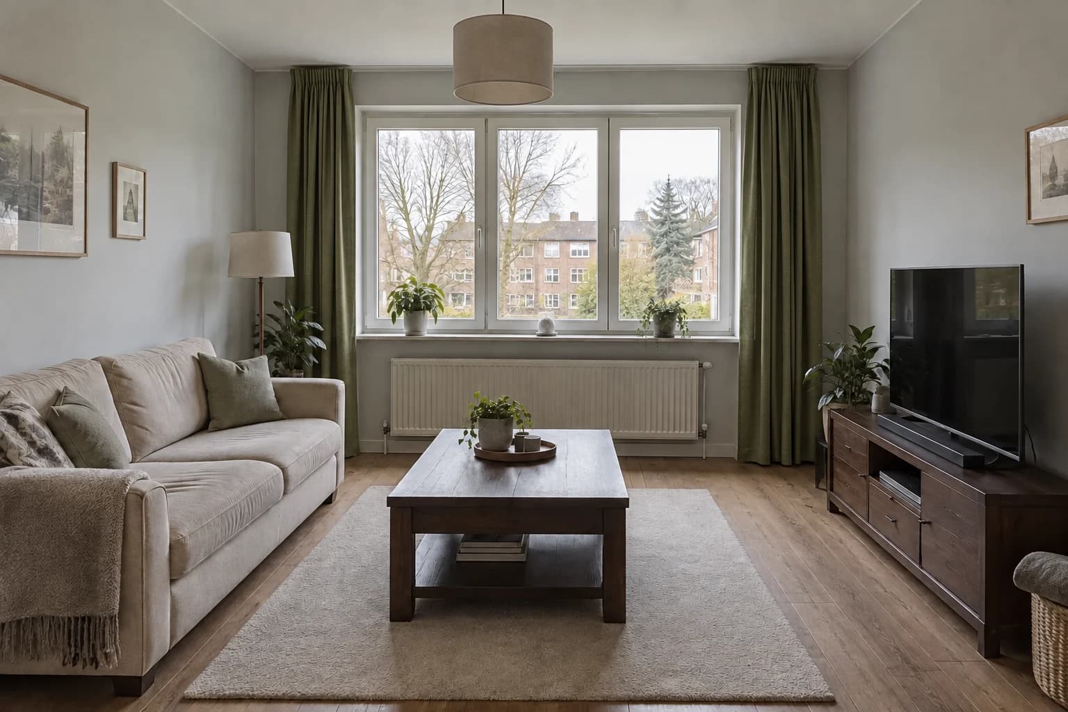
- Check the result: Check that the window remains visible and the curtains have not become a new opening or a different length. The worked example keeps the broad arrangement and introduces darker olive fabric.
4. Walnut coffee table finish
Use this when an existing piece has a useful shape but you are comparing wood tones. Name the table rather than asking for more walnut in the room, which can also recolor cabinets and flooring.
- Check the result: Check the table silhouette before judging the grain. If its legs or proportions change, the result is a furniture concept rather than a finish-only comparison.
Material and color: keep the surrounding palette
5. Sage cabinet fronts
Use this for a kitchen in which the counter and backsplash will stay. The surrounding finishes are essential to the color decision, so include them instead of judging a cabinet color in isolation.
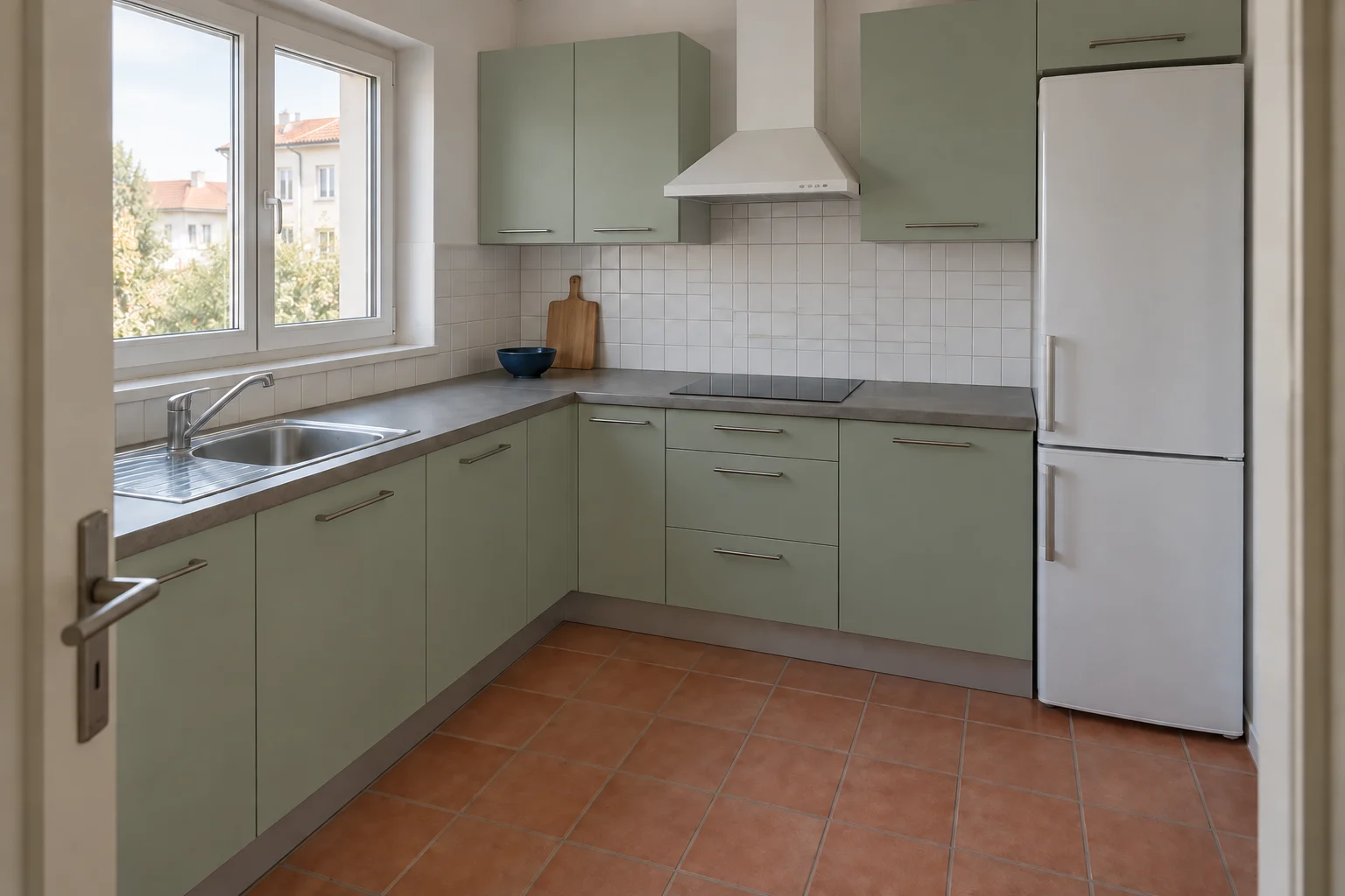
- Check the result: Compare the upper and lower doors in shadow and light. Reject an image that also replaces the counter when that surface is fixed.
6. Dark green backsplash
Use this when the cabinet color is settled and the wall band needs a stronger identity. The orientation request makes the example more concrete than asking for stylish tiles.
- Check the result: Inspect the strip beneath the window and the area behind the hob. Tile should stay inside the intended backsplash boundary.
7. Light oak flooring
Use this to compare a lighter floor with furniture you intend to retain. A floor-only request is most useful when the source shows enough exposed flooring around the rug and cabinet.
- Check the result: Check that the cabinet has not become lighter too. Apparent plank size is a concept, so confirm the real format separately.
8. Quieter bathroom grout
Use this after selecting a tile color when the grid feels too prominent. Keeping the tile itself fixed helps isolate joint contrast, although a model can still reinterpret the pattern.
- Check the result: Compare the joints around the mirror and shower. Check that a quieter grid was not created by removing tile lines entirely.
Whole-room directions: state the ingredients
9. Scandinavian with color
Use this for a broad direction when you are open to changing furniture and textiles. Concrete accents prevent a style label from becoming a room with no particular color identity.
- Check the result: List new furniture or accessories before deciding what to copy. A style concept can answer a mood question while still changing more than your project allows.
10. Mid-century teal and walnut
Use this to explore stronger upholstery color and visible timber furniture. The named palette makes it easier to identify which ingredient you like in a full redesign.
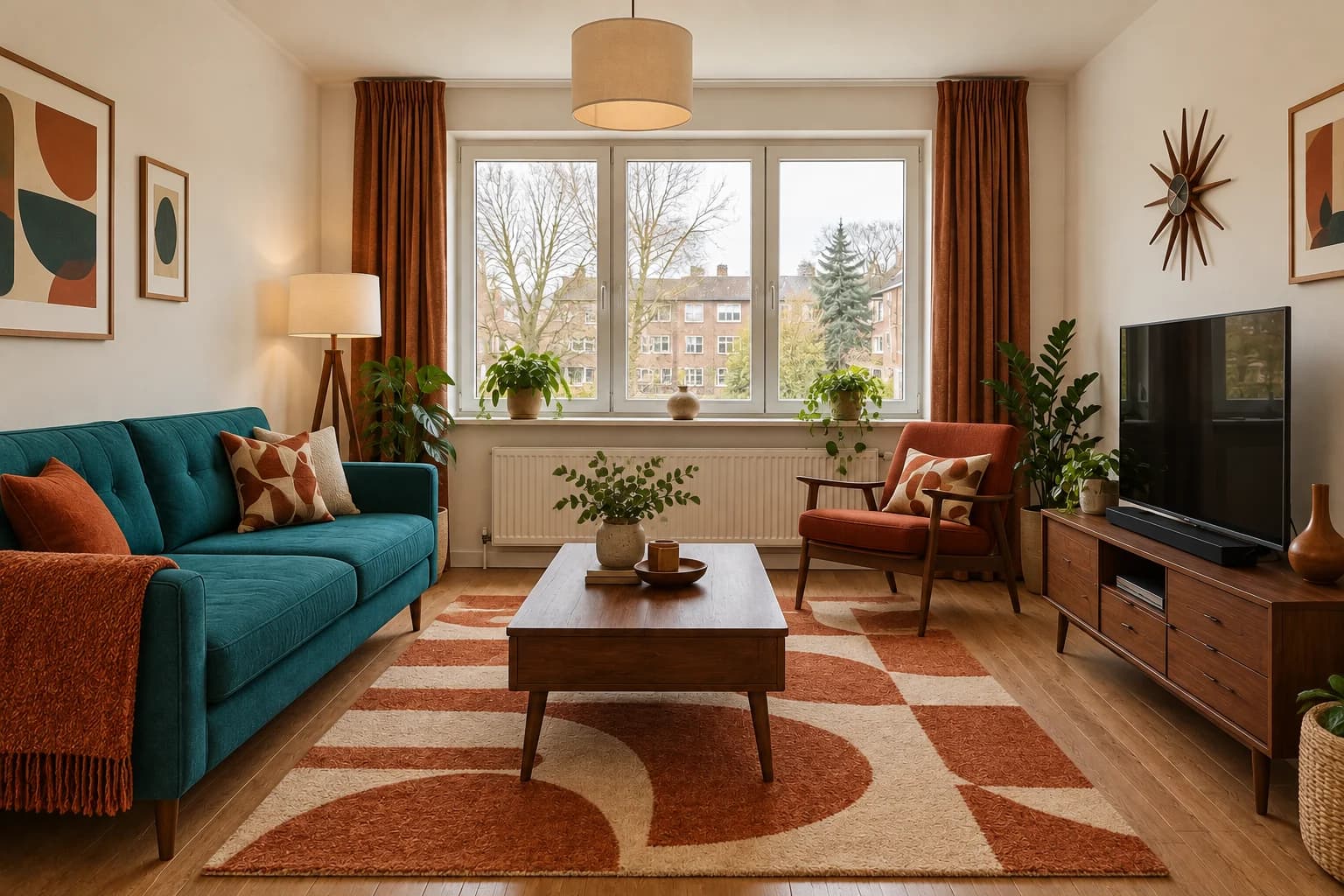
- Check the result: Inspect usable floor and heat-source access. If an extra chair appears, do not treat it as an approved layout just because the colors work.
11. Japandi with charcoal
Use this when you want a quieter composition but do not want an all-pale room. The darker upholstery and wood give the model a specific interpretation of restraint.
- Check the result: Separate darker materials from dimmer lighting. You may prefer the palette while wanting the daylight of the source image.
12. Contemporary cobalt
Use this to test saturated color with sharper graphic elements. Keep the number of accent colors limited so the result can be assessed as a coherent direction.
- Check the result: Check whether a patterned rug or new art is driving your preference. Test the sofa color alone if you plan to keep the other pieces.
Lighting concepts: change the mood deliberately
13. Softer daylight
Use this when strong sun patches distract from a material comparison. This is a visual lighting request; it does not calculate what daylight your actual room receives.
- Check the result: Look for an enlarged window or missing shadows that make the room misleadingly different. Compare material relationships, not measured brightness.
14. Evening lamp mood
Use this to explore a warmer evening atmosphere after choosing the palette. Keep it separate from a daylight color comparison so you do not confuse lighting with a new material finish.
- Check the result: Check that lamps have not multiplied and surfaces have not been recolored. Verify actual lighting choices using real fixtures and the room design.
15. Balanced window exposure
Use this when the outside view is much brighter than the room and the furniture is difficult to read. The aim is legibility rather than inventing additional daylight.
- Check the result: Check the original window divisions and the outdoor boundary. A cleaner image may still contain invented exterior details.
16. Reduce glossy reflections
Use this to discuss a quieter material impression when shiny surfaces dominate a concept. It is especially useful before looking for actual matte or satin samples.
- Check the result: Compare the finish only as an appearance direction. The model cannot establish a manufacturer’s sheen level or the maintenance of a surface.
Fix a result: name what should stay
17. Simplify a busy textile palette
Use this when the main sofa and wood direction work, but pattern competes for attention. Refer to the selected result as the parent so the accepted palette stays visible.
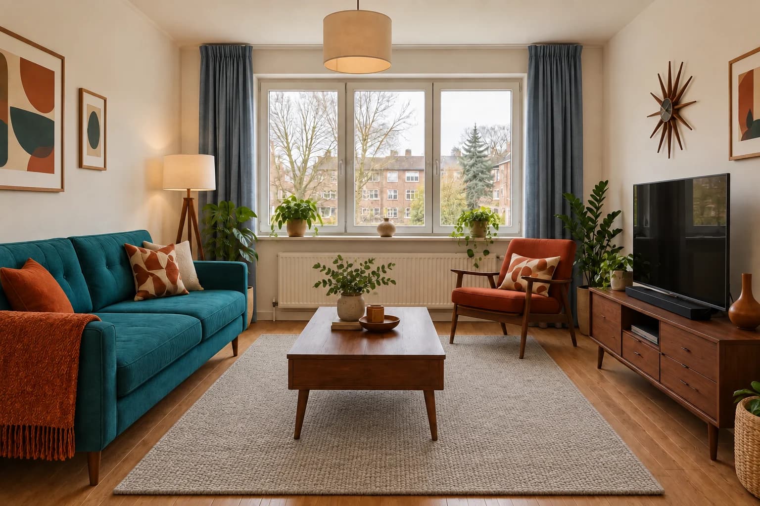
- Check the result: Check that the table or chair has not moved. Accepting the textile revision does not mean accepting incidental layout changes.
18. Remove an unwanted extra chair
Use this when a redesign adds seating that your room cannot accommodate. Name the object and its location so the correction is tied to a visible problem.
- Check the result: Compare the exposed area with the original room. The result is still a concept, so verify real circulation and furniture dimensions independently.
19. Reduce an overly bright color
Use this when you like a color family but the generated version is too saturated. A focused adjustment preserves the decision instead of replacing the whole style.
- Check the result: Check that the room has not simply become darker. A lighting change can make a color seem quieter without answering the request.
20. Restart after layout drift
Use this when several revisions have changed the window, furniture positions or apparent room size. Return to the original source rather than trying to repair every accumulated difference.
- Check the result: Check the fixed features before considering the paint. If the result still drifts, narrow the scope further or improve the source image instead of adding more style instructions.
Use the output to write the next request
Before generating again, write a short keep-and-change note. Keep the terracotta wall; change the curtain color back to the source. Keep the teal sofa; simplify the rug. A specific observation gives the next request a job, while make it better leaves the model to decide which parts you valued.
Compare major anchors first: window divisions, room boundaries and furniture positions. Then review the requested surface. Finish with incidental changes such as new art or brighter light. This order prevents an appealing color from distracting you from a room that no longer matches the source.
If you have a useful direction, move to the next source of evidence: a paint sample, fabric swatch, product dimensions or a measured design. A prompt can help you explore a relationship; it cannot establish exact colors, guaranteed geometry or installation requirements.
Questions about interior design prompts
Is a longer prompt always better?
No. Add information when it clarifies a visible surface, a fixed condition or a desired relationship. Repeated mood words and conflicting style names can make the request less focused.
Should I include a style name?
For a broad redesign, a style name can help when you also describe materials and colors. For a cabinet-only or rug-only edit, the surface and color may be enough.
Why does something change after I ask to keep it?
An image model can reinterpret parts of the source despite the instruction. Review the result, return to the original when needed and avoid treating a keep list as a geometric lock.
Can I copy these prompts directly?
Yes. Replace the objects and colors that do not match your room. Keep the scope narrow and check the output against your actual source image.