
Materials & color
Kitchen Cabinet Color Ideas: Compare Six Options in Your Kitchen
Compare warm white, sage, navy, greige, charcoal and muted blue cabinet fronts while keeping the counter, backsplash and floor in view.
Six attractive cabinet colors are only useful if they work with the kitchen around them. The same navy can feel different beside a pale stone floor and beside terracotta. A cabinet color visualizer helps you compare that relationship before narrowing the choices to real samples.
Here we change the fronts in one kitchen while asking to retain its existing finishes. Use the six options to choose the amount of contrast and the color direction you want. Then make the final shade decision on a sample in your own light.
Keep the counter, backsplash and floor in the picture
Cabinet color is a relationship between large surfaces. A cropped door sample removes the counter and floor that make a color work in your kitchen. Start with a level photograph showing the main cabinet runs, some floor, the backsplash and any appliance that will remain visible. Use this same source for all six colors.
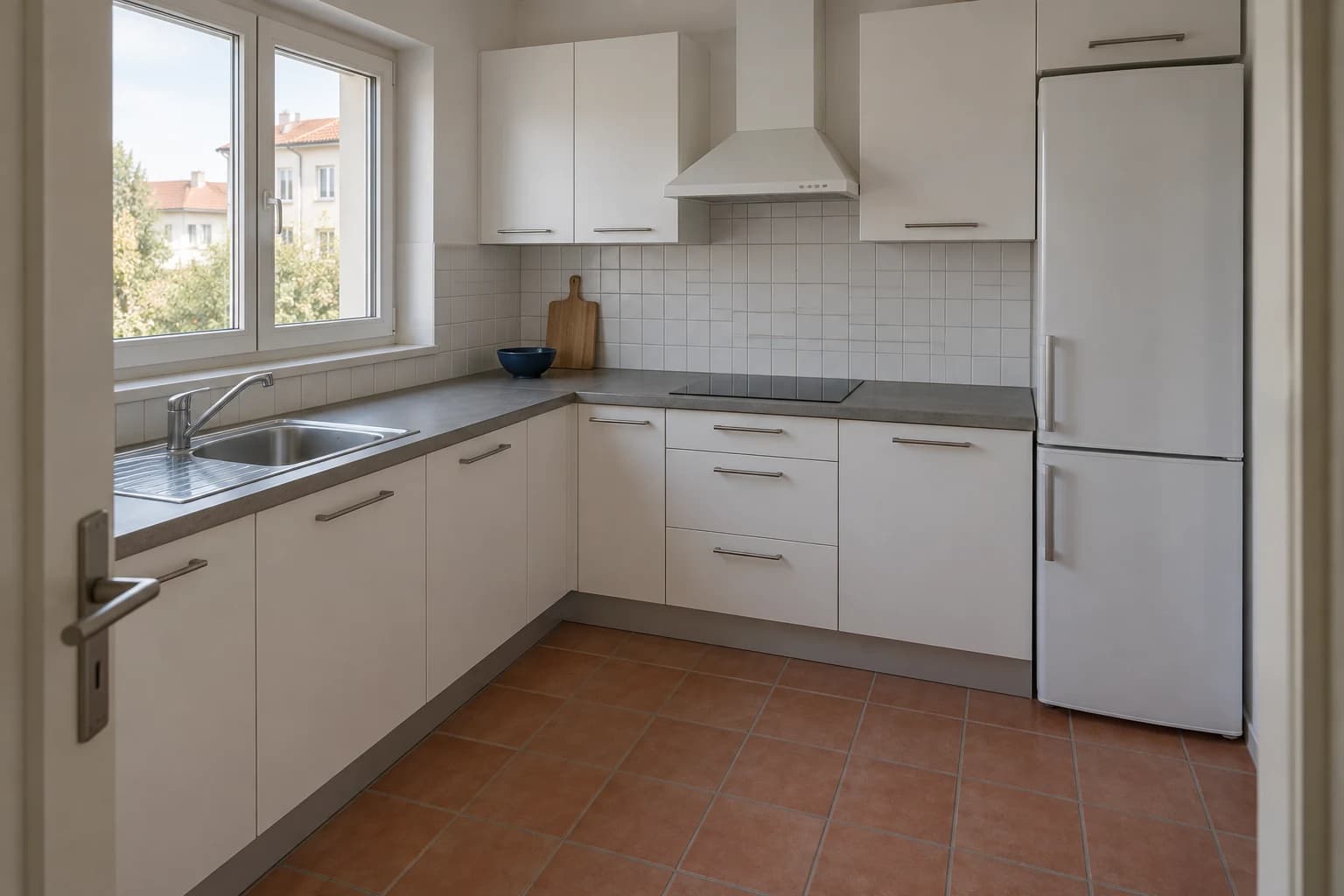
Our starting kitchen has a grey worktop, white square tile and terracotta flooring. Those finishes remain part of the brief. We also ask to preserve the window, appliances and handles. This is a cabinet-front color comparison, not a full renovation palette. If you want to replace the other finishes too, compare complete palettes first using the kitchen visualizer guide.
Compare six distinct directions
Begin with options that answer different questions: a near-white, a soft green, a deep blue, a warm neutral, a dark neutral and a softer blue. Giving them clear names makes the comparison easier to discuss. It also stops you from generating a long series of slightly different versions without remembering why each one exists.
Each image below starts independently from the reference kitchen. The instruction changes the cabinet fronts and asks to preserve the surrounding surfaces. Review the output anyway: image edits can subtly change material texture or exposure even when the requested scope is narrow. These images are color concepts, not exact paint matches.
Warm white
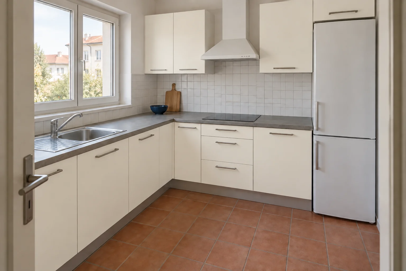
Warm white is the quietest change in this kitchen. It lets the terracotta floor remain the strongest color and keeps the upper cabinets close to the light backsplash. The difference from the original white is intentionally subtle: a screen image is a poor place to make a final decision between neighboring whites. Use this version to decide whether you want the cabinets to recede, then compare real samples for the undertone.
Hold a sample beside the backsplash and counter together. A warm white that looks pleasant on its own can look creamier beside a cooler white tile. If your two whites seem unrelated, test a less warm cabinet finish before assuming the backsplash also needs replacing.
Sage green
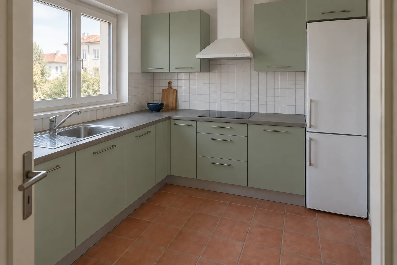
Sage creates a softer contrast than navy or charcoal, but it still gives the cabinet run an identity. The existing terracotta floor becomes part of a green-and-clay relationship rather than a surface to hide. This is useful when you want visible color without the darkest cabinets in the comparison. The exact balance between green and grey will matter more in samples than the broad name sage.
Compare the upper doors near the window with the base doors beneath the counter. Shadows can make the same color look considerably deeper. If you like the lightest door but dislike the darkest, try a paler or less grey sample in the actual room.
Navy
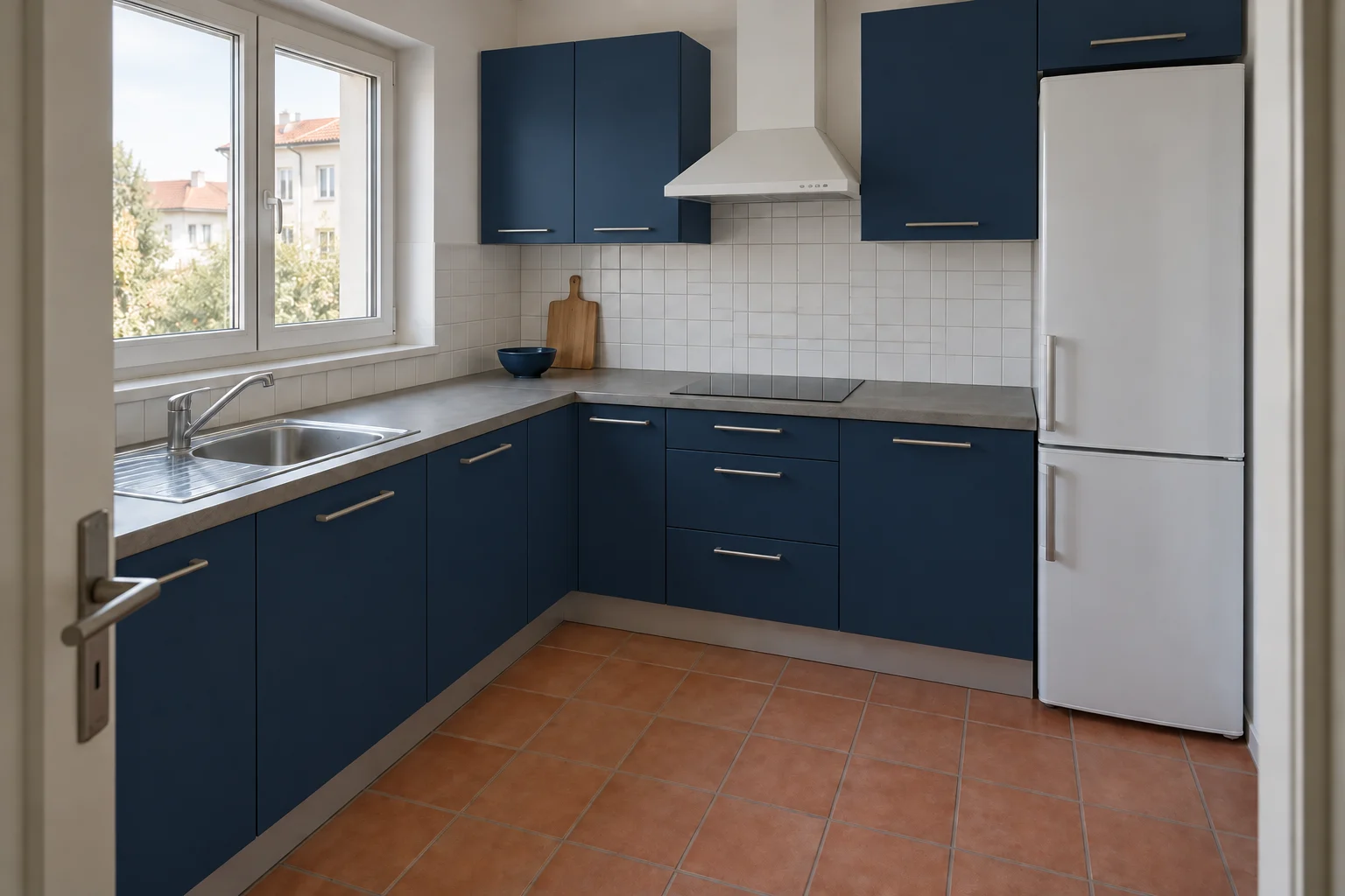
Navy makes the kitchen feel more graphic. The counter and backsplash form a pale horizontal band between the dark upper and lower cabinets, and the white refrigerator stands out more clearly. That appliance is part of the decision: do not judge navy using an image that has quietly replaced it with an integrated unit. Here the existing warm floor provides a counterpoint to the blue.
Look at the inner corner where the cabinet runs meet. Dark fronts can lose visible detail in shadow. Ask whether you like the complete dark run, not just a single well-lit navy door. A sample against the white fridge will also reveal how strong that contrast feels.
Greige
Greige sits between the warmer floor and cooler worktop. It offers a change from white with less color contrast than green or blue. In this setting the cabinetry remains relatively quiet, so the floor pattern and the edges of the handles stay noticeable. This can be a useful comparison even if you eventually choose color: it shows how much of your preference comes from changing brightness rather than hue.
Check the undertone under your own lamps. A neutral can lean pink, green or yellow in context, and a generated image cannot settle which commercial shade will behave best. Compare two samples at most once you have chosen this general direction.
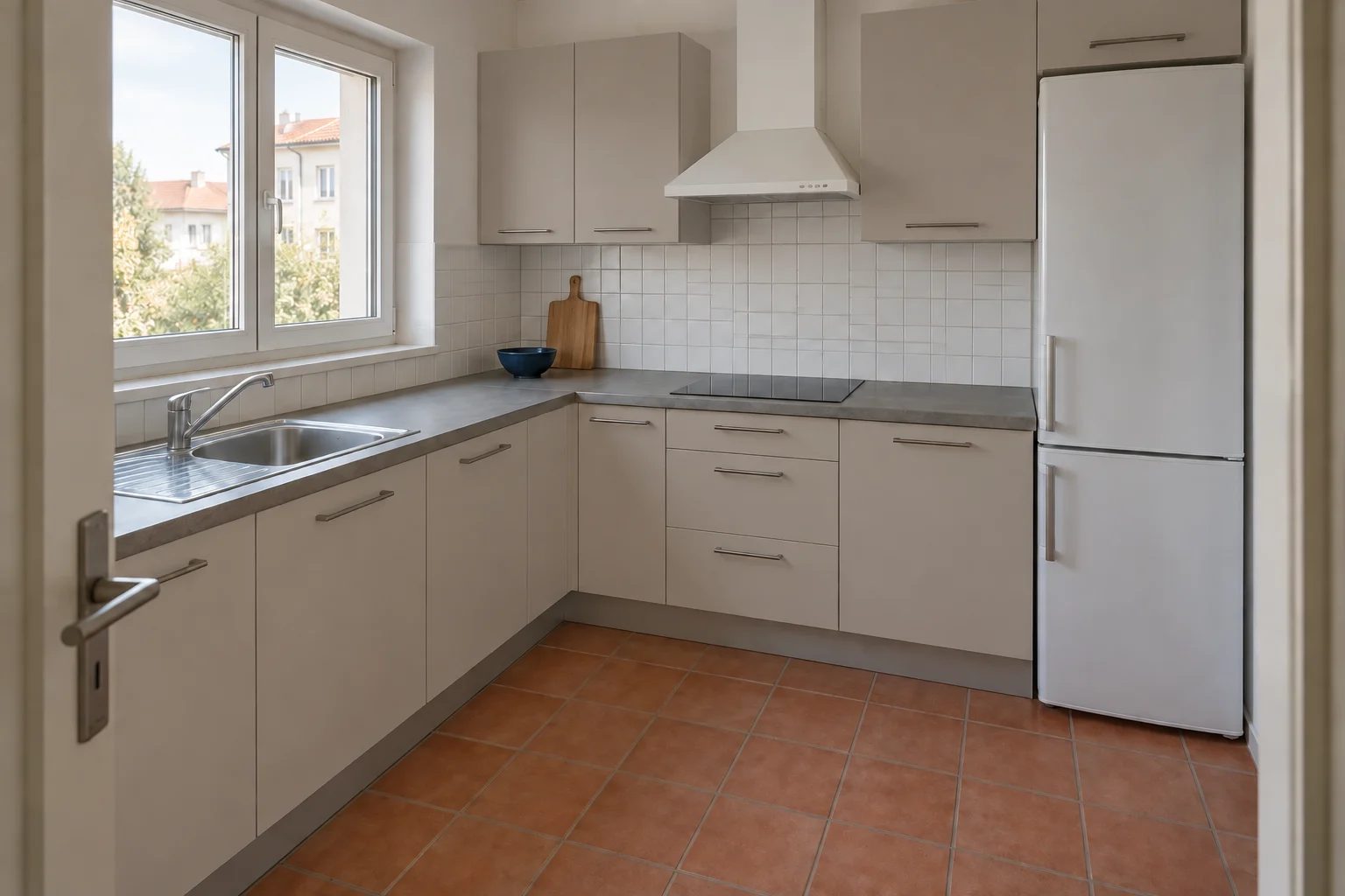
Charcoal
Charcoal gives the clearest dark-neutral alternative to navy. Without a strong blue hue, attention shifts toward contrast and the warm floor. The white backsplash reads as a separate band, and the cabinet arrangement becomes more pronounced. It is a useful way to ask whether you want a dark kitchen at all before choosing a dark color.
Inspect the room at the time you cook most often. The concept uses daylight, so it does not tell you how the charcoal will read under evening lighting. Keep a large sample upright on both cabinet runs and compare it with the counter, rather than assessing it flat on a bright table.
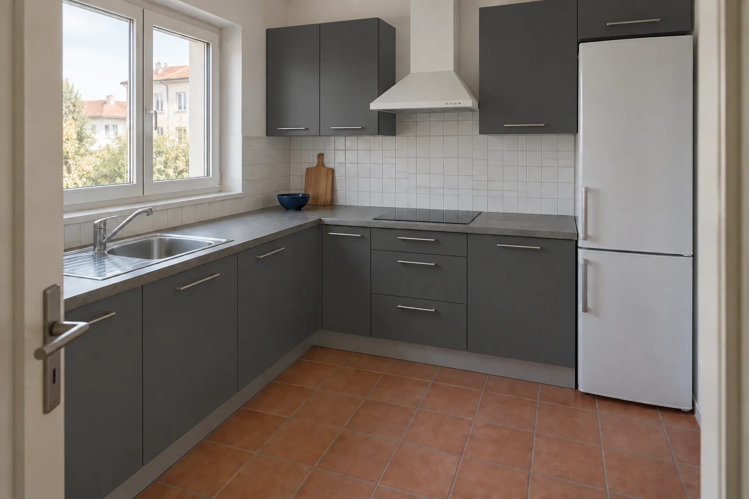
Muted blue
Muted blue offers some of the cool-and-warm relationship of navy without the same depth. The fronts remain distinguishable from the backsplash while allowing the terracotta floor to keep its warmth. It is a useful middle option if navy feels too strong and warm white feels too close to the starting kitchen. The degree of grey in the blue determines how quiet the result becomes.
Compare this option directly with sage, using the same image size. Both are softer colors, but they relate differently to the orange floor. Choose the relationship you prefer before considering handles, decorative lighting or a new countertop.
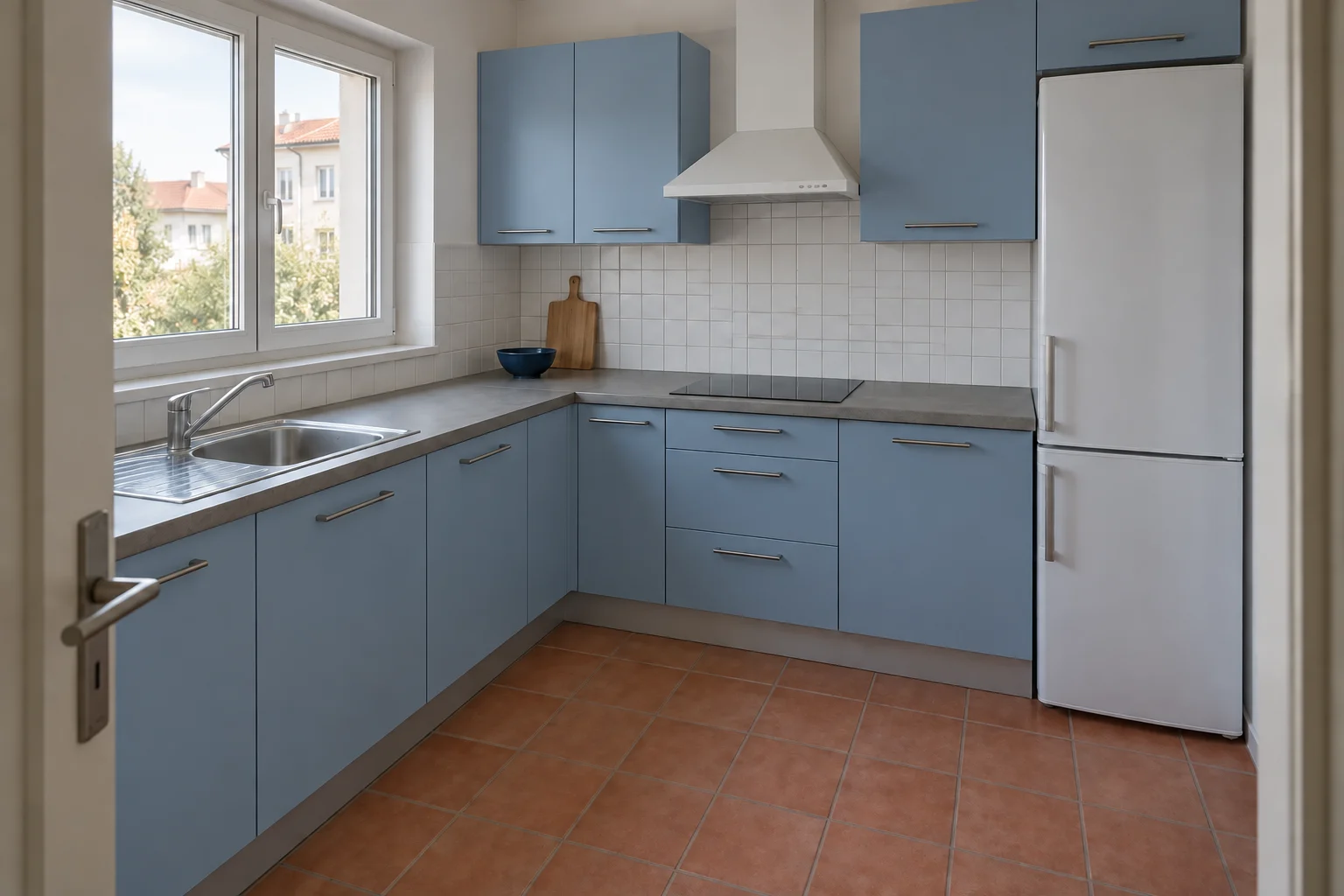
Reduce six colors to two
First choose the amount of contrast. Compare warm white with charcoal and notice how differently the white refrigerator and backsplash stand out. Then choose temperature: compare sage with muted blue against the same terracotta floor. This sequence separates two decisions that are easy to confuse when every image looks appealing in isolation.
Keep one preferred color and one credible alternative. Write a reason that refers to your kitchen: navy gives the counter a clear edge, or sage connects more comfortably with the floor. Avoid reasons that belong to the generated styling, such as a brighter window or a cleaner countertop. Those do not establish that the cabinet color is better.
| Color | Relationship in this kitchen | What to check on a sample |
|---|---|---|
| Warm white | The white fronts stay close to the starting palette, with a softer warmth beside the grey counter. | Hold a sample beside the backsplash and counter together. |
| Sage green | Soft green cabinet fronts introduce color beside the white backsplash and terracotta floor. | Compare the upper doors near the window with the base doors beneath the counter. |
| Navy | Deep blue cabinet fronts create a strong contrast with the white tile and warm floor. | Look at the inner corner where the cabinet runs meet. |
| Greige | A warm grey-beige finish bridges the grey counter and the clay-colored floor. | Check the undertone under your own lamps. |
| Charcoal | Charcoal fronts emphasize the pale counter, white appliances and terracotta tiles. | Inspect the room at the time you cook most often. |
| Muted blue | Dusty blue fronts add a cooler color at a lighter value than navy. | Compare this option directly with sage, using the same image size. |
Use a cabinet-only brief
Name the surface precisely. Cabinet fronts is narrower than kitchen or cabinetry, which can invite the model to reinterpret the entire room. Include the counter, backsplash, floor and appliances in the keep list. If the finish matters, describe matte or satin, but treat the resulting sheen as a concept rather than a verified product property.
To make another color comparison, return to the original image and change only the color phrase. Once you choose a favorite, you can use that result for a separate handle or backsplash experiment. Keep those later versions outside your initial color shortlist so you are still comparing like with like.
Check the shortlist on real cabinet samples
Ask for a sample of the finish you can actually buy or commission. A generic color name is not a specification, and the image does not identify a manufacturer or paint code. Put each sample vertically where a door will be, not flat on the counter. Compare it at the bright end of the run and in the shaded corner.
Review the samples in daylight and under your existing evening lights. Keep the counter and backsplash visible beside them. If neither sample looks like the relationship you liked in the image, describe what is wrong: too grey, too yellow, too dark or too saturated. That is a more useful next step than asking for an exact digital color match.
Only after the color decision should you finalize the finish system and preparation with your supplier or contractor. A visualization cannot tell you whether existing doors are suitable for repainting, how a coating will adhere or what preparation is required. Those practical questions can change the available options, so resolve them before ordering the full set of doors or materials.
Questions about kitchen cabinet colors
Which color works best with a terracotta floor?
There is no single winner. In these concepts, sage gives a softer green-and-clay relationship, navy creates stronger contrast and warm white lets the floor dominate. Compare those three effects in your own kitchen before choosing a shade.
Should upper and lower cabinets be the same color?
The six examples use one color to keep the comparison focused. If you prefer two-tone cabinetry, choose the main palette first, then test lighter uppers as a separate version while retaining the floor and counter.
Can I get the exact paint color from the image?
The image can communicate a direction such as dusty blue or warm greige. It cannot establish an exact commercial paint match. Use physical samples and the supplier’s finish information for that decision.
Do I need to change the handles too?
No. Keep them unchanged for the first comparison. A later handle-only concept can help you judge contrast, but check real dimensions and fixing positions before ordering replacements.