
Materials & color
Tile Visualizer: Compare Bathroom Tiles and Kitchen Backsplashes
Explore blue bathroom tile with two grout directions and three kitchen backsplash options, then refine color, shape and finish.
Tile color is only part of what you see. The shape, joint contrast and reflections can turn the same general palette into a quiet surface or a strong pattern. A tile visualizer is useful when you compare those choices in the room they will occupy.
This guide follows two examples: a blue bathroom wall with different grout contrast, and a kitchen with white, green or dusty pink backsplash tile. Start with a broad direction, then isolate one variable before moving to real samples.
Decide which tile surface you are comparing
A bathroom wall and a kitchen backsplash do different visual jobs. Bathroom tile can surround most of the room; a backsplash usually sits in a band between larger surfaces. Start by naming the exact area you want to change. Asking for new tiles throughout the room may also change a floor you intended to keep.
Choose a photograph with readable tile boundaries. In a bathroom, include the basin, shower and a corner. In a kitchen, include the counter edge, upper cabinets and the window if the tile runs beneath it. These fixed elements show whether a pattern works in context and whether generation has extended tile into a surface that should stay painted.
Use the same source for the first options, and keep the other finishes stable. Our bathroom comparison changes the blue wall tile and grout relationship. The kitchen comparison keeps white cabinets, a grey counter and terracotta floor while exploring three backsplash directions. These are two focused exercises rather than one all-purpose room makeover.
Bathroom tile: compare matching and contrasting grout
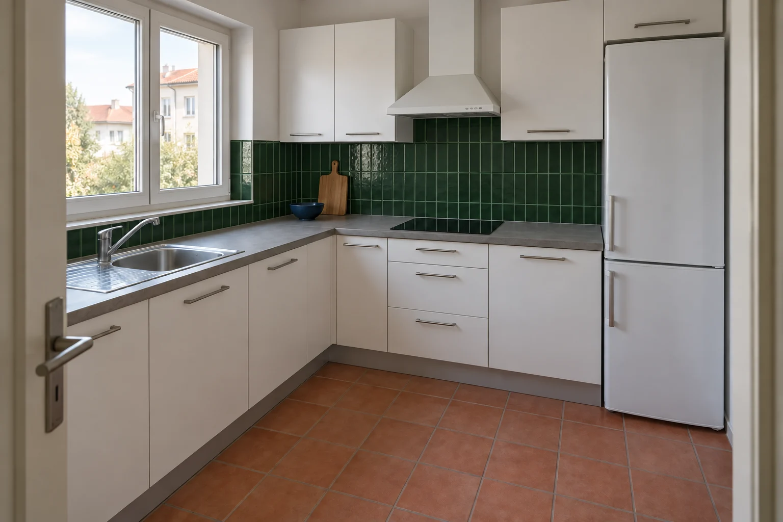
Grout changes how strongly you see the grid. Two walls with a similar blue tile can read as a broad color field or a series of individual squares. To explore that difference, we asked for cobalt square tile with matching blue grout, then generated an independent version with white grout from the same grey bathroom reference.
The results show the intended difference, but not as a perfect laboratory comparison. The blue-grout version still has visible lighter lines, and the model varies some tile proportions. Read the images as a lower-contrast and a higher-contrast direction. Exact tile size and grout width need to be decided from real materials.
Blue tile with a quieter joint
The wall reads more continuously when the joint stays closer to the tile color. Look beside the mirror and around the shower screen: those edges remain visible without every square attracting the same attention. This is a useful starting point if you want a strong wall color with less graphic pattern.
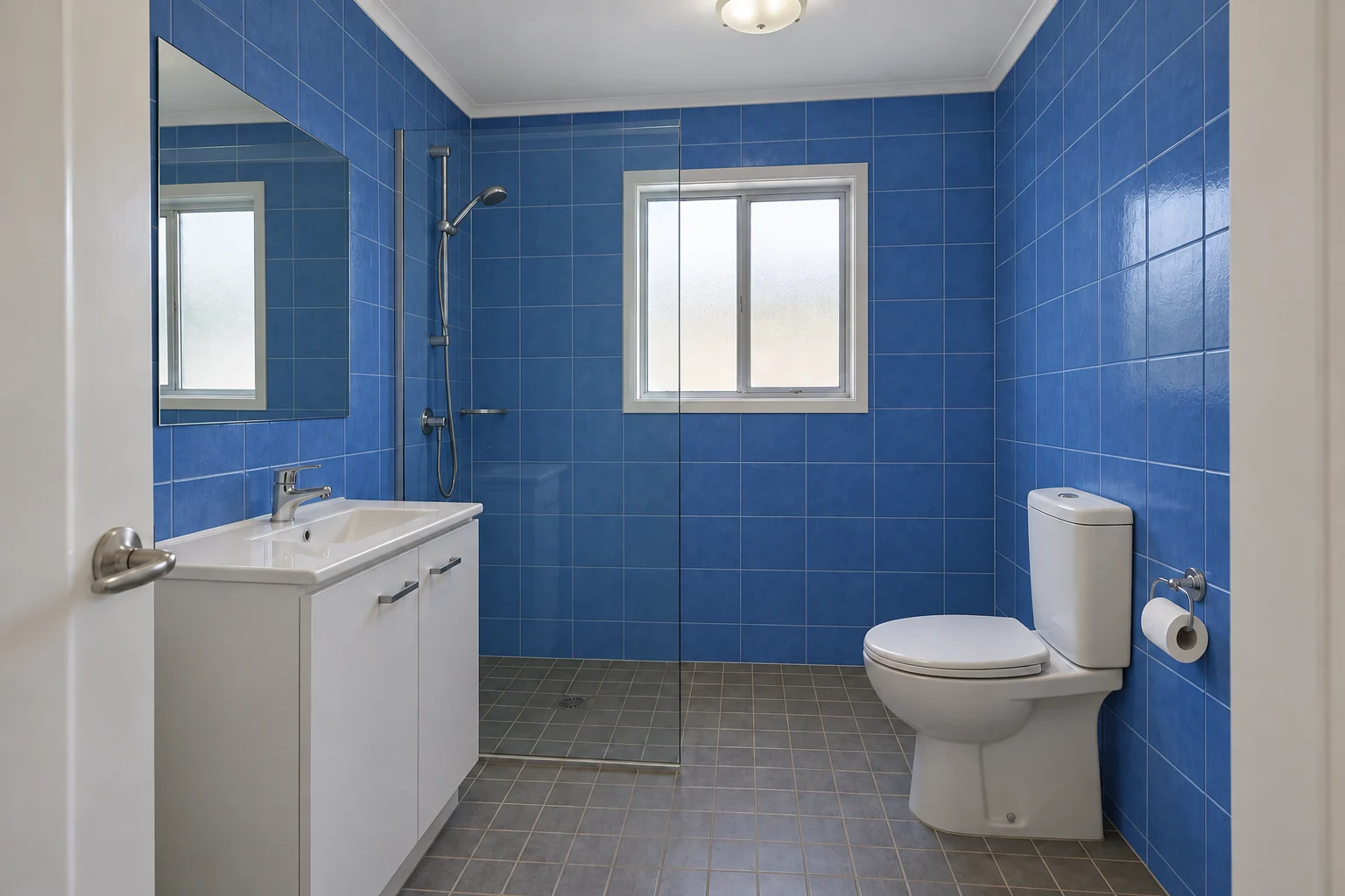
Blue tile with white grout
The white joints make the tile arrangement more explicit, particularly on the right wall. That can be part of the design, but it also means the pattern will compete with the window frame, mirror and glass edges. Compare the whole room before choosing based on a close-up of one attractive tile.
Kitchen backsplash: three different relationships
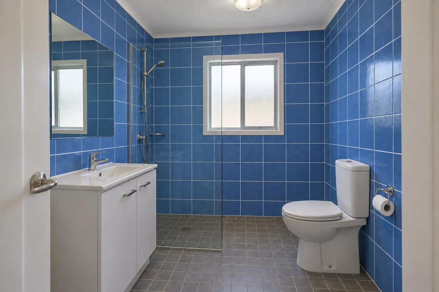
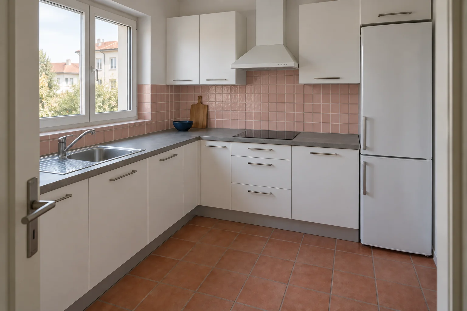
The white reference backsplash is the first option, not a missing design. It keeps the wall band close to the cabinet color and lets the floor remain the main warm surface. The two new concepts introduce forest green rectangles and dusty pink squares. Both are generated from the same kitchen reference with a backsplash-only instruction.
Because the green option changes both hue and tile shape, this first round compares complete directions. If you prefer it, a later round can hold the green constant while comparing vertical and horizontal placement. Do not conclude that vertical tile alone caused your preference when the color changed too.
White square tile: a quiet baseline
The existing white tile sits close to the cabinets, leaving the grey counter edge and terracotta floor easy to read. Keep this version beside the others throughout the comparison. Sometimes a new color is attractive on its own but does not improve the relationship you already have.
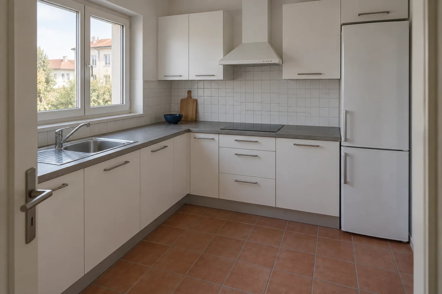
Forest green rectangles: a darker band
The green backsplash creates a clear separation between the upper and lower white cabinets. The vertical rectangles introduce a rhythm that differs from the floor grid. Inspect the strip beneath the window as well as the larger area behind the hob; a tile idea has to work in both places.
Dusty pink squares: warmth beside terracotta
The pink direction echoes the warmth of the floor without repeating its exact color. The smaller square pattern remains visible, and the slightly varied surface creates a softer reflection than a perfectly flat color field. Check whether that repetition feels connected or too similar to the floor pattern.
Separate color, shape and laying pattern
Once you have a preferred color direction, compare the next variable independently. Keep the cabinet and countertop colors in the brief and change only the tile format or orientation. Rectangular tile laid vertically and the same tile laid horizontally can suggest different rhythms, but the visualizer may also alter apparent scale. Use the result to discuss the idea, not to count rows.
If your wall has several interruptions, such as a window, hood and sockets, note them before generating. Check that they remain visible afterward. A seamless expanse of tile can look calmer precisely because the model omitted an interruption that exists in your kitchen. That version should not decide your final pattern.
Describe the finish as well as the color if reflections are central to the idea. Glossy forest green and matte forest green are different visual directions. A rendered reflection is only a suggestion, however; inspect a real sample under the light that will reach the surface.
| Option | What to compare | Next decision |
|---|---|---|
| Color | Keep tile shape and grout similar | Choose warm, cool or neutral |
| Orientation | Keep color and tile proportions similar | Compare vertical and horizontal rhythm |
| Grout | Keep tile color and layout similar | Choose a quieter or more visible grid |
| Surface | Keep the palette stable | Compare the real sample for sheen and texture |
Write a backsplash-only instruction
Use the name backsplash rather than kitchen walls if that is the limit of your project. Name the cabinet fronts, countertop and floor as fixed conditions. Include the window and appliance positions so the output has clear anchors. In the green example, the request also specifies vertical rectangles and subtle green grout.
After generation, review the boundary under the upper cabinets and at the counter. If the tile spreads beyond the intended area, return to the source image and make the scope more explicit. If the boundary is acceptable but the green is too dark, refine the color without asking for a new kitchen style.
Bring the tile and grout sample together
A tile sample without grout leaves part of the design undecided. Ask to see the proposed tile beside grout samples and, where possible, a small assembled display. The width, edge character and color of the joint all contribute to the effect. Your generated concept can communicate quieter joints or a stronger grid, but it cannot specify their actual dimensions.
View the combination beside the other finishes you are retaining. In the kitchen, put it near the counter and cabinet door. In the bathroom, compare it with the basin and vanity finish. This checks the relationships that made the concept appealing rather than judging the tile as an isolated object.
Confirm the product’s intended use and the installation details with your supplier and installer. The images do not establish wet-area suitability, cleaning requirements or a construction detail. Use measurements and the selected tile format to plan cuts, corners and quantities before ordering.
Questions about tile visualizers
Can I use the same tile idea in a bathroom and kitchen?
You can compare its appearance in both rooms, but context changes the effect. A small colored backsplash is a different visual commitment from surrounding bathroom walls. Confirm product suitability for each intended location separately.
Will contrasting grout make the room look busy?
It makes the grid more visible. Whether that feels busy depends on the other edges, patterns and surfaces in the room. Compare the full view with the mirror, cabinets and floor visible.
Can AI show an exact tile size?
It can suggest a format, but it may reinterpret scale and joint spacing. Use a measured drawing and actual product dimensions for the final layout.
Should I change the cabinet color at the same time?
For a backsplash decision, keep it fixed first. If you are planning both, compare a few complete palettes, choose one, then refine the tile within that direction.