
Materials & color
Kitchen Visualizer: How to Compare Finishes Before Renovating
Compare three cabinet, counter and backsplash palettes in the same kitchen, then turn your favorite into a shortlist of real samples.
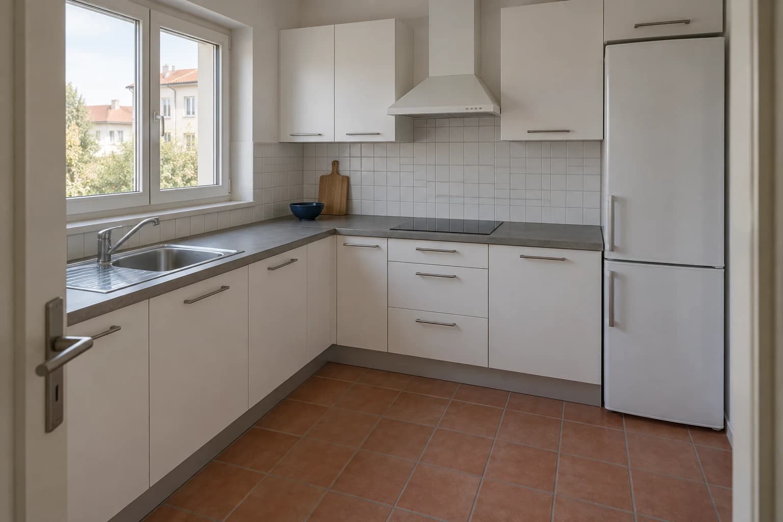
A kitchen visualizer is most useful when you compare a few complete finish palettes on the same image. Start with your kitchen photo, choose two or three combinations of cabinet fronts, countertop and backsplash, and keep the layout and existing floor as consistent as possible. Then refine one material at a time.
The question is not simply whether you like a green or blue cabinet. It is whether that cabinet works beside your counter, under your daylight, and against the floor you plan to keep. This guide explores three distinct directions: graphite with walnut, sage with light stone, and navy with terracotta. Use the images to choose a direction, then confirm the materials with physical samples.
Start with the kitchen you actually have
Choose a photograph that shows the main cabinet run, the counter edge, the backsplash and some floor. A view from a doorway or the opposite corner often explains more than a tightly cropped shot of the sink. Keep the camera level and avoid a panorama that bends the cabinet lines.
Remove temporary clutter that hides the surfaces you want to compare. A kettle can stay if it helps you judge scale; a row of bags covering the backsplash cannot. Aim for balanced daylight rather than an overexposed window and dark cabinets. Use the same source image for every initial option so that changes in framing do not become part of your comparison.
Write down what is staying before you choose colors. If the floor, appliances and cabinet arrangement are fixed, include them in every brief. In our reference kitchen, the terracotta floor is part of the starting condition. A finish that looks good only after the floor has quietly changed is not answering the original question.
Your three-line brief
Keep the brief close to the decision you are making.
- Keep: the cabinet arrangement, window, appliances and existing floor.
- Explore: the fronts, countertop and backsplash as one palette.
- Decide: which combination deserves physical samples, not which image looks most luxurious.
Compare complete palettes first, individual finishes second
Begin with three combinations that differ in a meaningful way. Three almost identical whites may be useful later, but they will not tell you whether you want a dark, contrasting kitchen or a softer colored one. Give each option a short name so you can describe what makes it different without relying on image order.
Changing three surfaces together is appropriate for this first direction-setting pass. Once you prefer a palette, stop changing everything at once. Use the selected image as the basis for a narrower comparison: the same sage fronts with two backsplashes, for example. This separates choosing the overall look from choosing its details.
For each first pass, return to the original kitchen image. Generating option B from option A can carry over its cabinet color, lighting or decorative choices. Ask for consistent framing and fixed features, then check the actual result: those requests guide the image but do not lock its geometry.
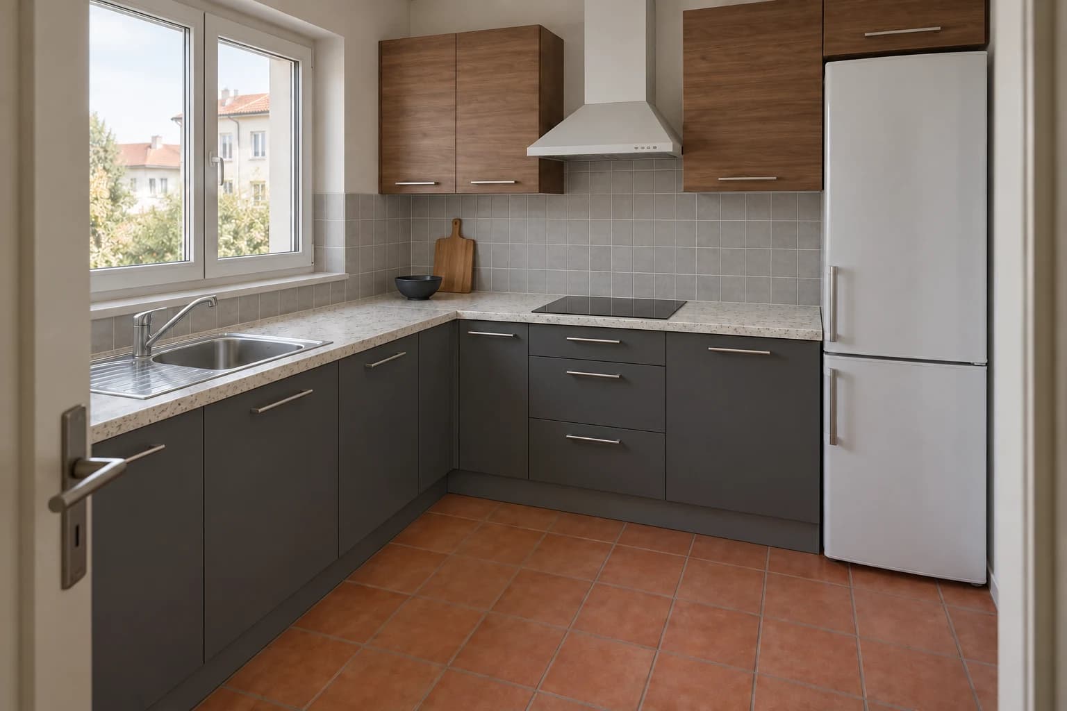
Option A: graphite and walnut for a sharper contrast
Graphite lower cabinets give the kitchen a darker base. Walnut-toned upper fronts add a different material rather than another shade of grey. A pale speckled counter and a quiet grey backsplash keep the wall surfaces from competing with the wood grain. Against the warm floor, the darker cabinetry creates a clear contrast.
This direction is worth exploring if you like a more graphic, contemporary kitchen. Look at the balance between upper and lower cabinetry: too much dark material around a small window can make the room feel visually heavy. The pale counter gives your eye a continuous line through the darker surfaces.
On real samples, compare the walnut undertone with the floor. Two warm materials can work together without matching, but orange wood beside an orange floor may create more warmth than you intended. Check fingerprints and cleaning instructions for the chosen dark cabinet finish with the supplier; an image cannot establish how it will wear.
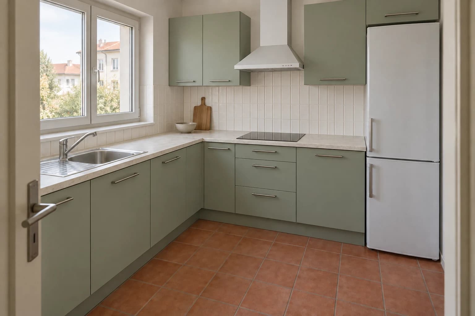
Option B: sage and light stone for a calmer color balance
Muted sage fronts introduce color across the cabinetry without the same dark-light contrast as graphite. Pair them with a light, softly patterned stone-look counter and off-white vertical tile. The result depends on the green: a greyed sage gives a different impression from a yellow olive, especially next to a reddish floor.
Use this option to assess whether you want color to be the main cabinet finish rather than a small accent. Watch the relationship between the counter and backsplash. If both have visible movement, the narrow strip of wall between counter and upper cabinets can become busier than it looked on separate samples.
Compare the green beside the actual floor in daylight and under your existing evening lighting. Do not choose a branded paint code from the generated shade. Take the image as a description of the direction you want, then use the manufacturer's samples to choose the specific color and finish.
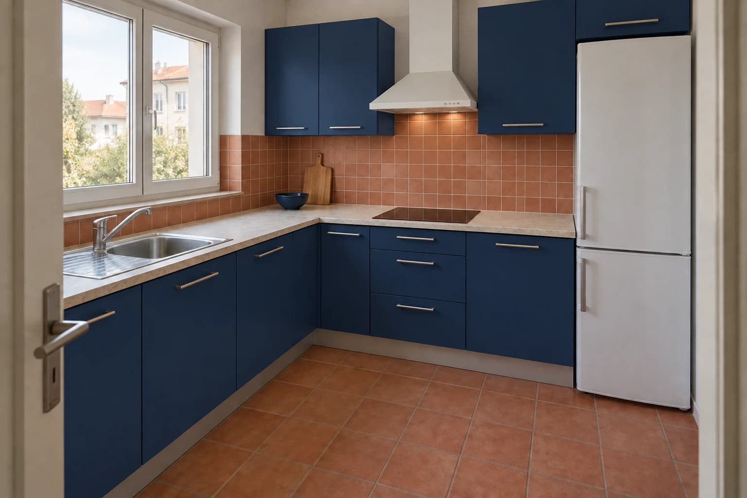
Option C: navy and terracotta for a more expressive kitchen
Deep navy cabinets and a terracotta-colored backsplash create a stronger warm-cool pairing. A light counter provides a pause between them. This is the most colorful of the three directions, and the existing floor becomes an active part of the palette rather than a background surface.
Pay attention to how much terracotta appears on both the wall and floor. Repeating the color can connect the room, but a backsplash with a much redder undertone may feel separate. Keep counter pattern restrained while you judge that relationship; introducing dramatic veining would add another competing decision.
This option also makes it easy to spot misleading lighting changes. If the navy looks attractive only because the generated room is brighter than your source photo, compare the materials in your real kitchen before proceeding. A glossy tile can look very different from a matte sample, even when their colors are similar.
Choose a direction, then change just one surface
Put the three options beside the original photo and identify one reason to keep or reject each. ‘I prefer this’ becomes more useful when you can say ‘the dark lower cabinets balance the warm floor’ or ‘the backsplash competes with the counter.’ Select one leading palette and one alternative rather than collecting more unrelated styles.
Now vary the least convincing surface in your leading option. Keep the sage fronts and light counter, for example, and compare a plain backsplash with the vertical tile. Ask for that single revision and check that cabinet lines, appliances and other finishes have not changed with it. If they have, the comparison needs another review.
| Palette | Visual effect to compare | What to check on a sample |
|---|---|---|
| Graphite + walnut + pale counter | Strong contrast with a visible wood element | Wood undertone beside the floor; cabinet sheen and care requirements |
| Sage + light stone + off-white tile | Colored cabinetry with softer contrast | Green undertone; whether counter veining and tile texture compete |
| Navy + terracotta + light counter | A clear warm-cool contrast | Wall-to-floor color relationship; tile gloss under actual lighting |
Turn the concept into a small sample kit
Order or borrow the cabinet, counter and tile samples for your leading palette. Place them together in the kitchen, with the cabinet sample upright and the counter sample horizontal. Include the grout color if it forms a visible part of the backsplash. Look at the set at different times of day before making a final choice.
Use the generated concept to communicate how the materials should work together, then confirm the actual products, dimensions, edge profiles, installation details and care requirements separately. A stone-like appearance does not tell you whether a surface is natural stone, engineered material or laminate. Your supplier and installer should verify the specification and practical suitability.
Questions about kitchen finish comparisons
Can I compare finishes without changing the kitchen layout?
Ask to retain the visible arrangement and work from the same source photo for each palette. Review openings, cabinet divisions and appliance positions in every result. The comparison is useful for visual direction, but it does not guarantee an unchanged or measured layout.
Should I change the cabinets or countertop first?
Start with what is already fixed. If the countertop stays, use it as a constraint when choosing cabinet and backsplash options. If all three surfaces are changing, compare complete palettes first, then refine the surface you are least sure about.
Will the generated color match the paint or tile I buy?
Do not treat the displayed shade as an exact product match. Generated lighting, screen settings and material interpretation affect the image. Use physical manufacturer samples in the kitchen to choose the final shade and finish.
How many options are enough?
Three clearly different palettes are a practical starting point. Once you can explain why one works better for your kitchen, narrow the comparison. More images are useful only when they answer a specific unresolved question.