
Design process
AI Rendering for Interior Designers: Create Three Concepts from One Room
Build a focused three-concept presentation from one room, turn feedback into a revision brief and keep design decisions traceable.
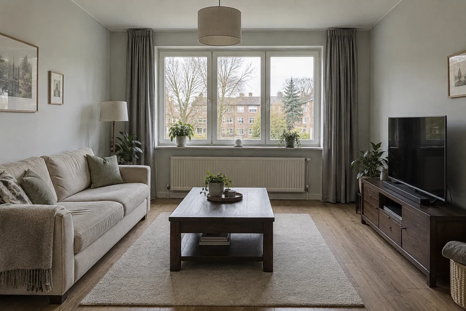
An early concept presentation should make a design decision easier. AI rendering can help you show different material and color directions from a common room image, provided the options stay connected to a clear brief. The useful work is choosing what each option tests, then translating feedback into a focused revision.
This guide uses three concepts and one follow-up to demonstrate that process. It covers the source image, comparison notes, feedback and handoff, with an explicit distinction between an appearance direction and the measured design behind a project.
Write the decision before generating the options
Begin with the question the presentation should answer. For this example: which material and color direction should guide the next design stage for the same living room? The fixed conditions are the rear window, radiator and the main sofa-and-media arrangement. Furniture appearance and textiles can change, but the room should remain recognizable.
This is an editorial example of a design workflow, not a reported client project. The three directions come from the same room used in our style comparison, selected here to demonstrate a shorter decision set. That shared source lets us focus on how to present and refine the options rather than implying three unrelated images belong to one project.
Add practical boundaries to your own brief: pieces that must be retained, areas that need access and decisions already approved. Keep those notes beside the image. A model may not preserve every constraint, and the reviewer needs to know which changes are acceptable before judging the appeal of a result.
Choose three directions with meaningful differences
Three options are useful when each expresses a different answer to the brief. Here they are a light blue-and-yellow direction, a quiet charcoal-and-rust direction, and a more expressive teal-and-orange direction. The names describe visible ingredients, so the conversation can move beyond whether someone identifies with a style label.
Generate each initial direction from the same source. Keep the framing request consistent and ask for the same architectural anchors. If you build option C by editing option B, inherited changes may make the comparison less clear. Use parent-to-child revisions later, after a direction has been selected.
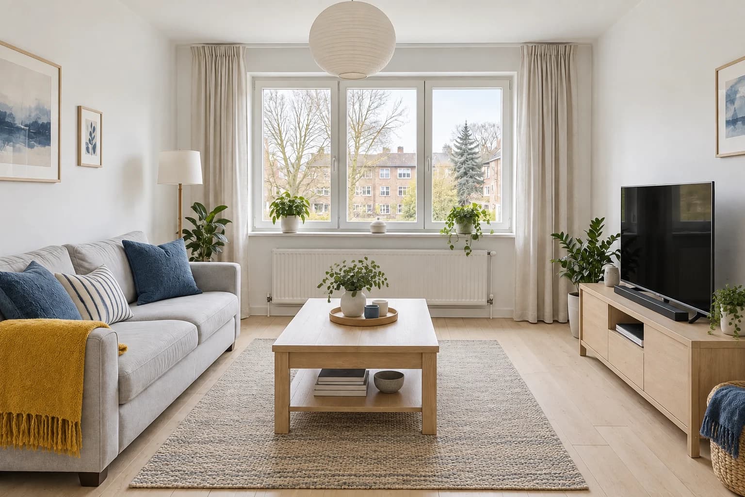
A: light wood, blue and yellow
This concept keeps a light background with pale timber furniture and a grey sofa. Blue cushions and a mustard throw make the accents easy to identify. It offers a useful first question: should the room stay visually light, with color concentrated in replaceable textiles? Note the changed pendant and added plants when presenting it.
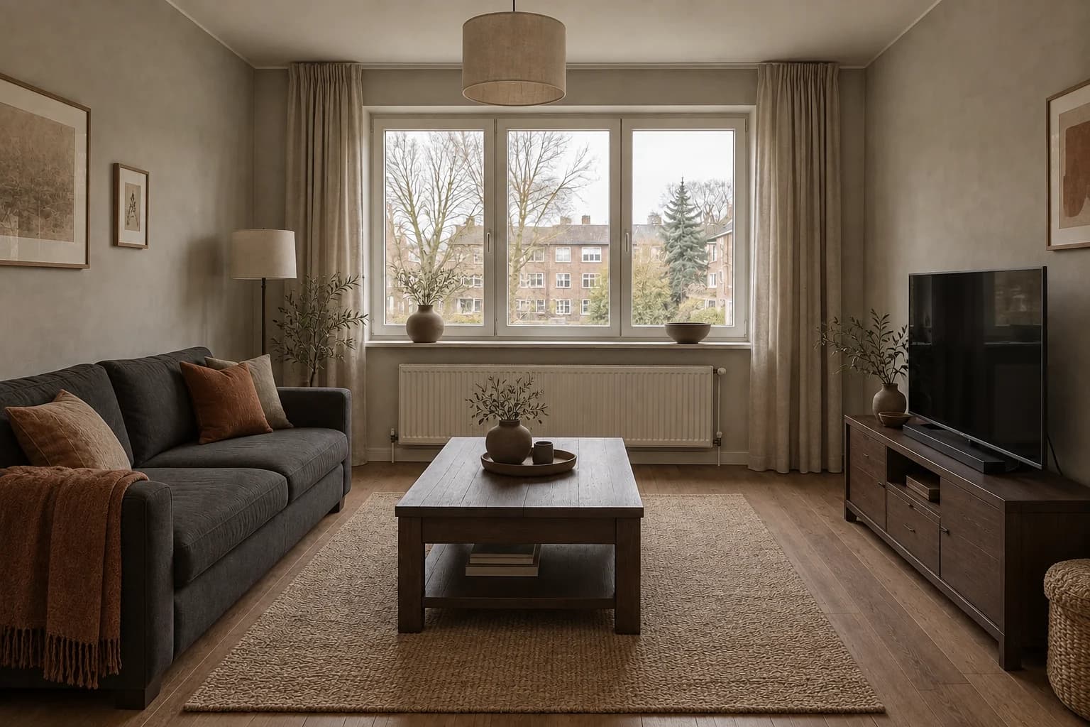
B: charcoal, smoked wood and rust
The darker sofa and timber create a quieter, more grounded band across the room. Rust textiles provide warmth without a large saturated wall color. The image also has a dimmer mood than A. Call that out explicitly so a preference for brighter light is not mistaken for rejection of the material palette.
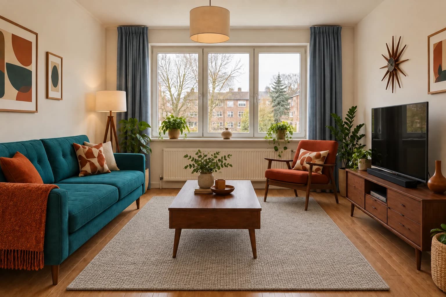
C: teal, walnut and orange
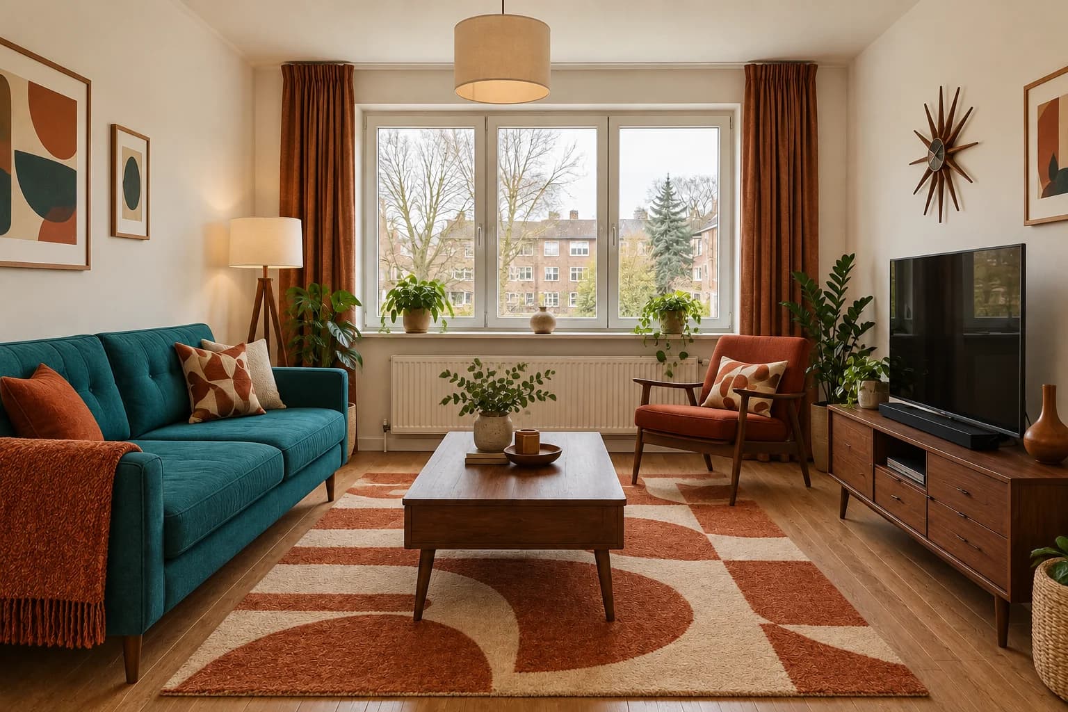
The teal sofa, orange chair and geometric rug create the strongest color contrast of the three. This direction also introduces an additional seat, so it changes the spatial demand as well as the mood. The chair partly occupies the radiator zone: keep that as an unresolved layout issue rather than presenting it as an approved arrangement.
Present the same information for every concept
Use the same image size and a short, consistent set of notes. Give each concept a name, identify the main palette and list any departures from the brief. This presentation can be assembled in your usual document or slide tool; the method does not depend on a special client presentation feature.
Put the source image within easy reach of the three options. It gives the discussion a common reference when someone asks whether the window, cabinet or chair position has changed. Avoid hiding a less flattering source view, because that makes it harder to distinguish a design improvement from a model making the room larger or brighter.
Do not rank the concepts before collecting a response. Instead, ask for reactions to specific elements: the timber depth, sofa color, rug pattern and amount of contrast. Someone may prefer the palette of C and the quietness of B. That combination gives you a clear revision brief, while a simple vote for C may conceal the same concern.
| Concept | Palette | Decision it explores | Open issue |
|---|---|---|---|
| A | Pale wood, grey, blue and yellow | Light background; color in textiles | Review added styling |
| B | Charcoal, dark wood and rust | Low contrast and a quieter mood | Separate dimmer lighting from palette |
| C | Teal, walnut and orange | Strong color and geometric pattern | Review extra chair and radiator access |
Turn a reaction into an editable brief
Imagine the response is: keep the teal and walnut, but make the room less busy. That is useful as a direction, but less busy still leaves several possible changes. Identify which elements carry the visual activity: the geometric rug, orange curtains, patterned cushions and extra chair. Then decide which of those to change in this round.
Our worked revision keeps the teal sofa, walnut furniture and orange chair, replacing the graphic rug with a plain pale grey one and the orange curtains with slate blue. It addresses textile contrast without asking for a different room style. The chair issue remains open and should be reviewed separately; this revision is not a claim that the layout has been resolved.
Record the request in plain language alongside the selected parent image. If later feedback asks why the rug became simpler, you can trace the change to a decision rather than guessing from filenames. This is particularly helpful when several people comment at different times.
Review the revision as a response to feedback
The new result replaces the rust-and-cream rug pattern with a quieter pale field. The curtains move toward slate blue, so the teal sofa and orange chair carry more of the remaining color contrast. This is a smaller decision than choosing a whole new style, and the visual difference is easy to connect to the feedback.
Check what else changed. The coffee table appears repositioned within the rug area, so the output is not an exact copy with only two surfaces recolored. That does not make it unusable as a mood revision, but it matters if someone starts reading the image as an arrangement to execute. Separate the accepted textile direction from unresolved positioning.
Compare the revision with its parent and the original photograph. Each comparison has a purpose: parent versus revision shows the response to feedback; original versus revision shows how far the proposal has moved from the source room. Keep both visible before deciding what is ready for the next stage.
Translate the image into design decisions
A useful handoff names what is accepted and what is still open. For this example: retain the teal-and-walnut direction; investigate a plain pale rug; compare slate-blue curtain samples; verify the chair and radiator relationship in the measured layout. That is more actionable than sending the latest render with no explanation.
Build the next material shortlist around those decisions. Find actual upholstery, curtain and rug samples, and compare their undertones together. Identify furniture that meets the intended proportions using real dimensions. The generated image does not establish a product schedule, an available item or a guaranteed finish match.
Keep construction, electrical and installation decisions in the project documentation that can support them. AI concepts can help align expectations about appearance, but a persuasive image can also make an unresolved detail seem settled. A short open-issues list helps preserve the distinction without overwhelming the visual presentation.
Keep the version history small enough to use
Use descriptive names such as C teal-orange, C quieter textiles and C chair review. Keep the initial options separate from selected revisions. This makes it possible to return to the agreed direction if a later image introduces an attractive but unwanted change. A collection of twenty unlabeled outputs creates more ambiguity than choice.
After each round, decide whether to accept the requested change, revise it or return to the source. If the next question is about feasibility, budget or a product sample, another image may not be the right next step. The purpose of concept work is to move a decision forward, not to accumulate increasingly polished versions.
When presenting externally, describe the images as AI-generated concepts and explain the decisions they illustrate. Do not imply a finished built project or an exact product render. A clear description helps the audience give feedback at the right level: palette and mood now, measured details and specification in the appropriate stage.
Questions about AI rendering in a design workflow
Why show three concepts instead of ten?
Three distinct directions can make the first decision easier to explain. Add another only when it answers a missing part of the brief. More images are not automatically more useful choices.
Should I use a client’s real room photo?
Use an image you are authorized to work with and choose a view that explains the fixed conditions. Remove unrelated personal information from the presentation. This example uses a generated reference room.
Can a concept replace a measured model render?
It can support early material and mood decisions, but it does not provide the same geometric authority as a verified model. Keep dimensions and construction decisions tied to the measured design.
How do I handle contradictory feedback?
Separate the comments by element. Confirm what should stay, what should change and what remains undecided before generating again. One focused revision is easier to assess than a request that combines incompatible directions.